Introduction
Exploring how OpenStreetMap data developed over time across different administrative units might reveal interesting insights into the self organizing approach of the OSM communities and can potentially be used to derive intrinsic data quality indicators. It might even be possible to estimate the completeness of OSM for a specific key-value combination as done by Barrington-Leigh & Millard-Ball (2017) for the road network.
Here we want to investigate the development of health related amenities across countries. The focus of the post will be on exploration of the data to highlight a few interesting patterns. A scientific rigorous analysis is not the aim of the post but will follow in a dedicated scientific journal.
Data and methods
We queried the OSM history by using the OpenStreetMap History Data Analytics Platform – if you are unfamiliar with the ohsome platform (OSHDB and ohsome API) we encourage you to explore the related blog posts:
- idea
- general architecture
- OSHDB open access journal article
- blog series: “How to become ohsome” first post,second post,third post, fourth post, fifth post
We queried ways and nodes but not relations for the key-value combinations provided later on, used national boundaries to group by and monthly time steps.
Results were stored in the postgresql database of the OSM history explorer (see the related blog post) and further analyzed by R & Rstudio using the packages from the tidyverse, ggplot2, forcats, stringr, RPostgreSQL and DBI.
Data exploration
Saturation type time series
If we look at France and Hungary it looks as if the number of hospitals has reached a peak which we might take as an indicator that the number of hospitals in both countries have been completely mapped (give or take a few). There have been some interesting ups and downs in Hungary.
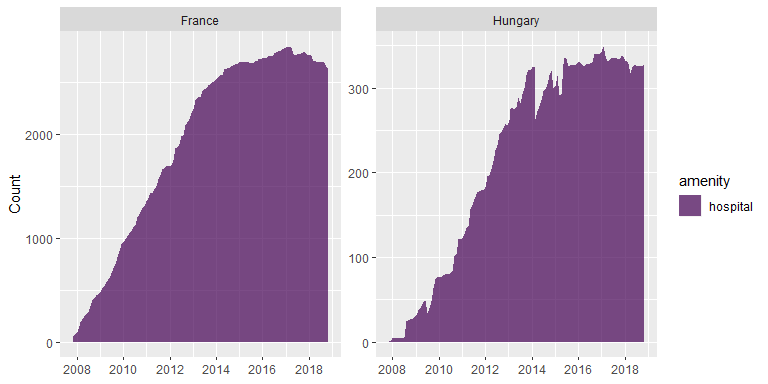
Fitting a standard logistic saturation curve leads to reliable results. For France the estimated number of hospitals equals 2800 with a standard error of 11.3. For Hungary the estimated number of hospitals equals 333 with a standard error of 1.8.

The mapping of amenity=hospital for Haiti and Lesotho seems also to have leveled of. However the process looks different with steep jumps. For Haiti the jump corresponds to the disastrous earthquake in 2010 and the mapping activities by the HOT and OSM community afterwards. For Lesotho the steep increases can be less clearly linked to single events but could potentially be related to the Lesotho Mapathons.
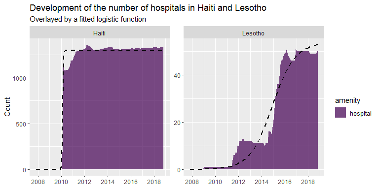
In general one should be careful to interpret saturation curves too literally. Have all hospitals in Haiti been mapped or did the mapping activities stop leaving parts of the hospitals unmapped? If we would have looked at Lesotho in early 2014 we might have concluded that all hospitals have been mapped since the time series seemed to have leveled of. However, the strong increase afterwards shows that this would have been a wrong conclusion.
So even if the standard logistic curve fits the time series for Haiti quite well, we need to think carefully if the fitted asymptote (1296.56 , standard error: 5.4 ) is a reliable estimate of the number of hospitals. For Lesotho it is clear that it would be better to use a function that combines two logistic curves.

Fitting a double logistic curve to the development clearly leads to a better fit which is also indicated by means of a comparison of AIC (Aikaike Information Criterion) values. The saturation asymptote is here estimated as 49.18 with a standard error of 0.21.
For Haiti it is worth to look at the spatial distribution of mapped hospitals. Are they mapped all over the country or are they concentrated in specific parts? If the later would be true we might take this as an indication that mapping might be incomplete – e.g. because mapping activities after the earthquake in 2010 would have concentrated at a specific part of the country.
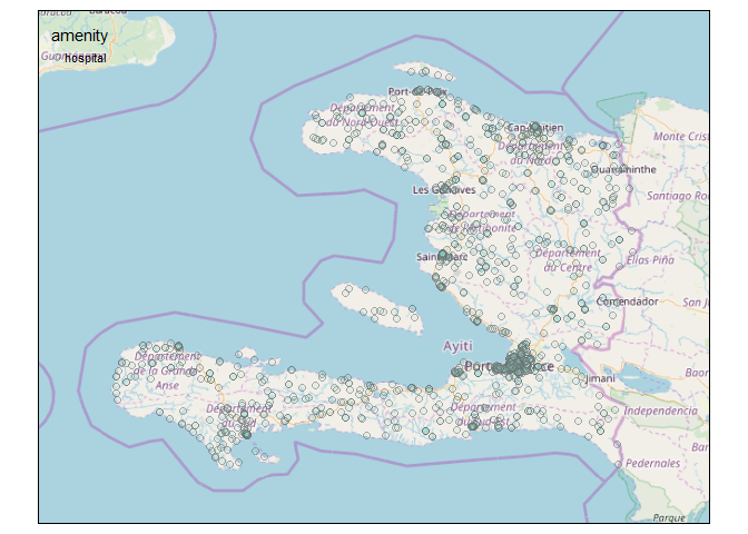
As we can see from the map hospitals in Haiti are mapped all over the country. Not unexpectedly, hospitals are concentrated around the capital Port-au-Prince. The map gives at least no immediate indication of a geographical bias in the mapping activities.
Increasing trend
Other countries such as China or India show still an increase in mapped hospitals.

Fitting saturation curves here comes of course with a high attached uncertainty since not even the inflection point might be in the observations.

The expected number of hospitals in China is estimated as 7004.01 with a standard error of 305.09. For India the estimate is 7220.21 with a standard error of 136.93 – since the inflection point is part of the observations (from the perspective of the model fitting procedure) the estimated uncertainty of the parameter estimate (here the asymptote) is lower compared to China.
Stabilisation followed by a decrease
Both Belgium and Germany show first an increasing number of hospitals and a decay after a stabilisation period (which was longer in Belgium and relatively short for Germany). The decay might be related to either a real decrease in hospitals (which is at least for Germany the case) or due to a revision of the OSM data.
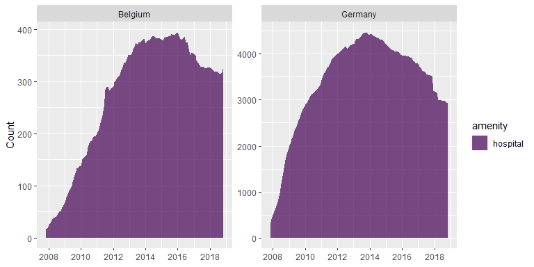
Fitting a monoton increasing function would not describe the behaviour too well in this situation. The functional relationship could for example be modelled by a Holling type IV relationship or by a double logistic function with a negative slope in the second part of the function.
Stabilization followed by a sharp decrease
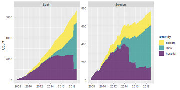
Spain and Sweden show a confusing pattern: after an increase followed by a – shorter or longer – saturation phase the number of ways or nodes tagged by amenity=hospital show a sharp decrease.
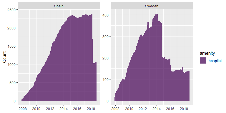
We suspect that this might have been caused by a tag diversification and plot the count for amenity=clinic on top of the count of amenity=hospital. Tagging of amenity=clinic has begun much later in both countries and seems to explain the sharp decrease supporting the hypothesis that a tag diversification has been taken place.
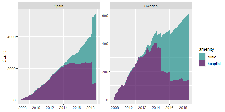
In both cases it looks as if no saturation has been reached. If we would have looked at e.g. Spain in 2017 we presumably would have assumed wrongly that a saturation had been reached at around 2,200 hospitals. After the tag diversification it looks as if the number of hospitals is much lower (~1,000). Estimating saturation levels for clinics hospitals or their combination from the available information seems not unproblematic.
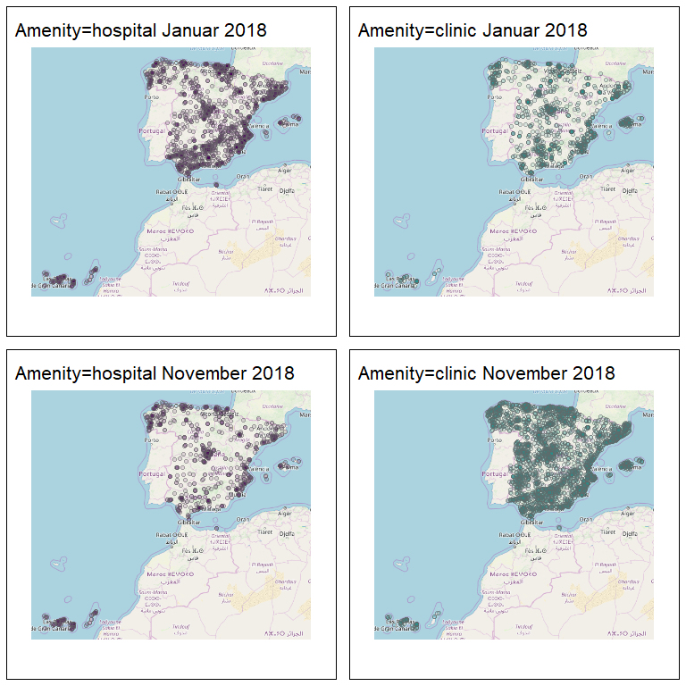
Mapping the distribution of amenity=hospital and amenity=clinic for January and November 2018 shows that the tag-diversification was not presumably concentrated on specific parts of the country but seems to have affected the whole country in a similar way. This seems remarkable given the regional cultural diversity of Spain.
We could even go one step further and add a third health related amenity (doctors) on top of the stacked figure. Taken all three objects together it seems as if the mapping of health related amenities in Spain and Sweden has not leveled of so far.

Interesting observations
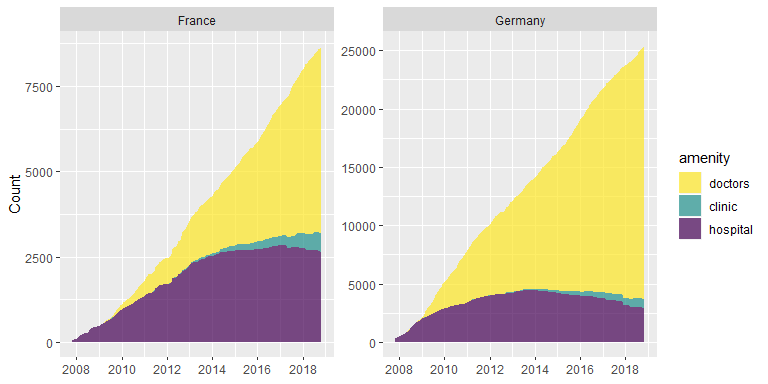
Germany and France
Both France and Germany show an ongoing mapping of ways and nodes with amenity=doctors while clinic and hospitals seemed to have been mapped more or less completely. Remarkable is also the much higher number of amenity=doctors in Germany (~25,000) compared to France (~8,000) which can not be explained by differences in population size (France ~67.12 Mio. Inh., Germany ~82.79 Mio. Inh.).
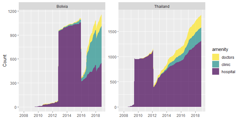
Thailand and Bolivia
Thailand and Bolivia are interesting since they show a strong increase in the mapping of hospitals followed by a steep descent, followed by an increase afterwards. Potentially, the strong increase could be triggered by a mass import and the drop by the removal of mass imported objects.
Concluding food for thoughts
The development of health related amenities captures interweaved phenomena: the tagging of real world phenomena, changes in tagging conventions, external events that trigger mapping activities (such as earthquakes or tsunamis) as well as mass imports. In addition, real world phenomena change over time: health related amenities might be created or be taken out of use (e.g. in Germany). To understand differences between countries it is also helpful to look at local tagging guidelines – amenity=clinic is for example defined differently in Spain and Germany. Differences in the health systems are of course of importance as well. In Spain for example ambulant clinics are much more common than in Germany.
We invite you to have a look at the full detail of all countries here: Charts for all countries.
We will continue with OSM history analysis in further blog posts – so stay tuned.
And if you are studying geography at University of Heidelberg and are searching for a topic for your Bachelor or Master thesis in the domain of OSM history analysis feel welcome to approach Alexander Zipf or Sven Lautenbach.