Open Healthcare Access Map is a new web application by HeiGIT to provide insights into healthcare supply on different spatial scales for many countries worldwide.
The web application is available here: https://apps.heigit.org/healthcare_access/.
Please note that this is a prototype and feedback on improvements and desired functionalities is very welcome. You can reach us at this email address.
The idea for the web app arose from previous analyses on accessibility estimations with the isochrone service from HeiGIT’s openrouteservice and population data from WorldPop. With the open healthcare access map we now provide results from this research in a more interactive format, for more countries and additionally aggregated on three different scales. The data layers used for the application and their spatial relation are shown schematically in figure 1.
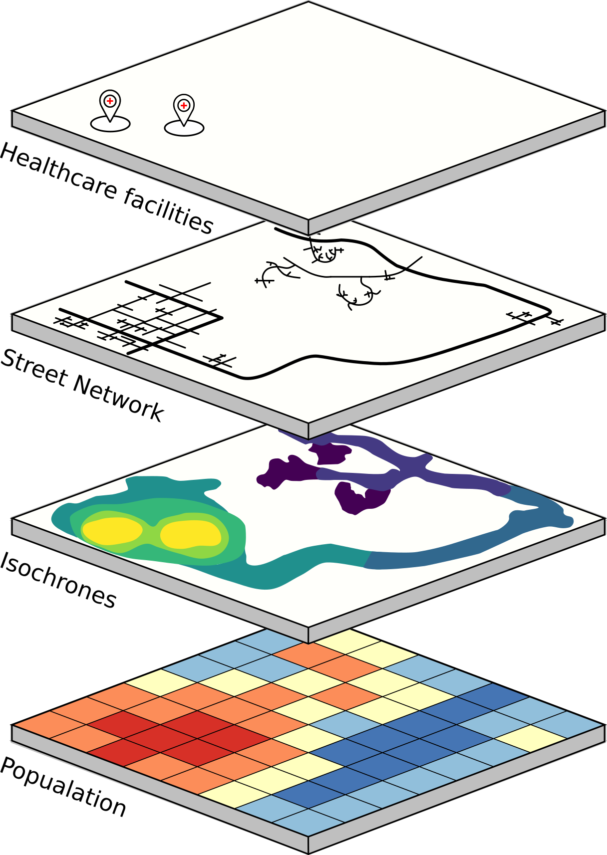
Fig. 1: Schematic overview of the interaction of the locations of healthcare facilities, the roadnetwork, isochrones and population distribution.
How to use the web app
On the landing page https://apps.heigit.org/healthcare_access/ you can select a country of interest either from a drop-down list or directly from the map.
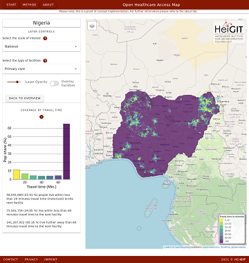
Selecting a country opens the respective country view. Each country view has its own URL. For Nigeria this is: https://apps.heigit.org/healthcare_access/countries/nga. The country view initially starts at the country scale with primary healthcare facilities (see fig. 2).
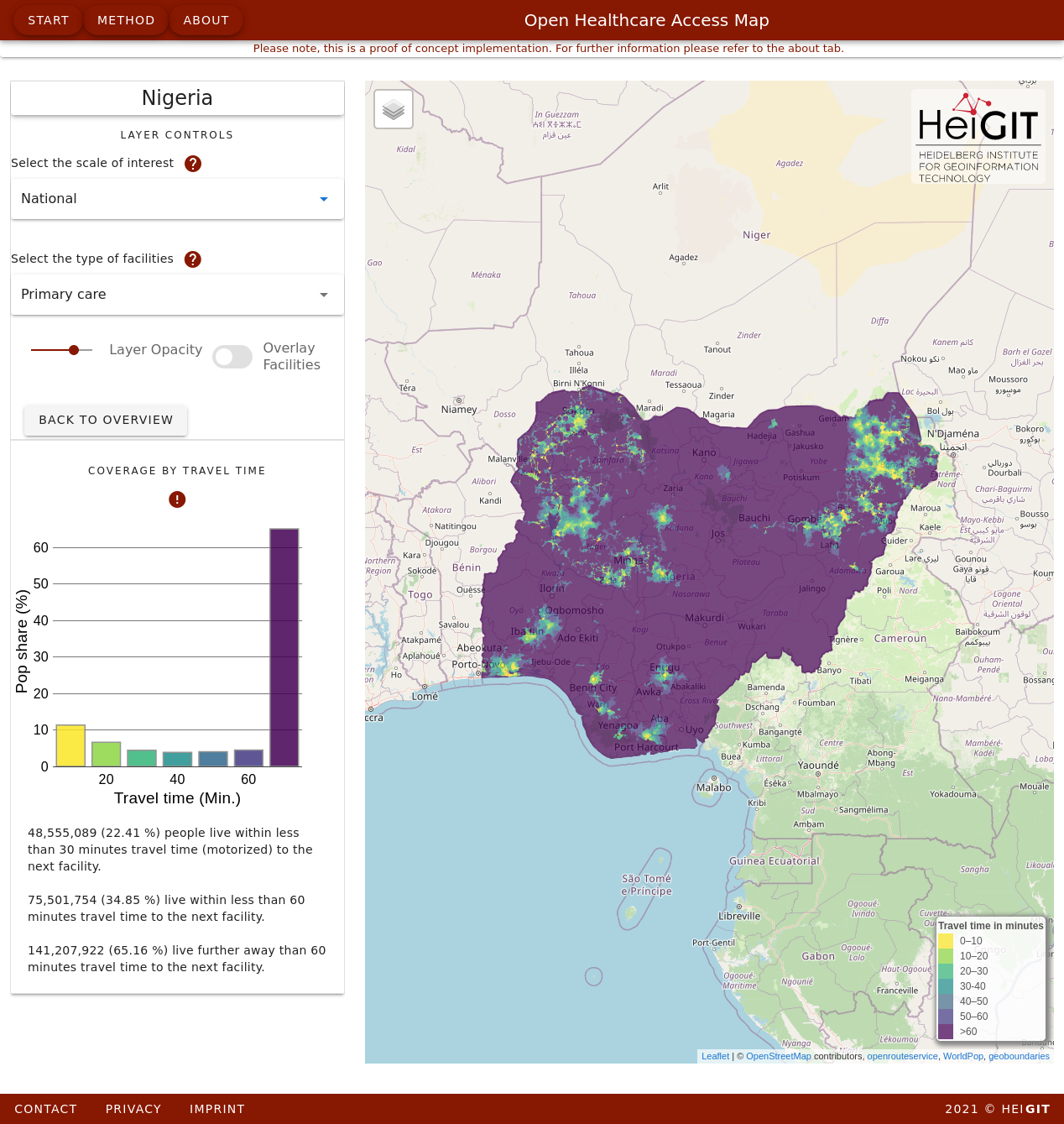
Fig. 2: Nigeria country scale for secondary and tertiary healthcare facilities.
You can change the scale and facility type of via drop-down lists. Currently, the facility types available for selection are primary care, secondary & tertiary care, and a combination of the two. Primary care mainly encompasses outpatient and preventive care facilities, while secondary and tertiary care includes inpatient treatment facilities. When selecting a different scale or type, the map loads the corresponding result layer and diagram. For the country scale, a bar graph shows the relative population living within each interval (10minutes) to the nearest health facility.
Other available scales are the first administrative plane and a hexagon layer. The hexagon layer is based on the isea3h hexagonal grid in resolution 8. The hexagon scale is accompanied by a histogram of relative population coverage within 60 minutes travel time to the nearest health care facility (see Fig. 3). The hexagon scale is accompanied by a histogram with the relative population coverage within 60 minutes travel time to the next healthcare facility (see fig.X).
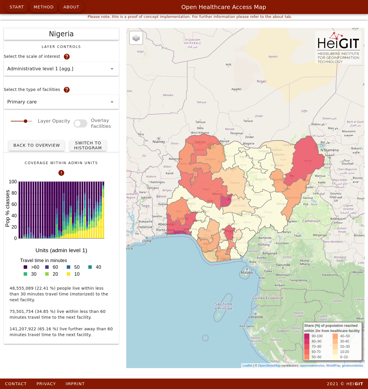
Fig. 3: Nigeria administrative (level 1) scale for secondary and tertiary healthcare facilities.
The same histogram is available for the administrative scale. Additionally, a stacked bar chart that allows details about the distribution by 10-minute intervals within each administrative unit (see Fig. 4).
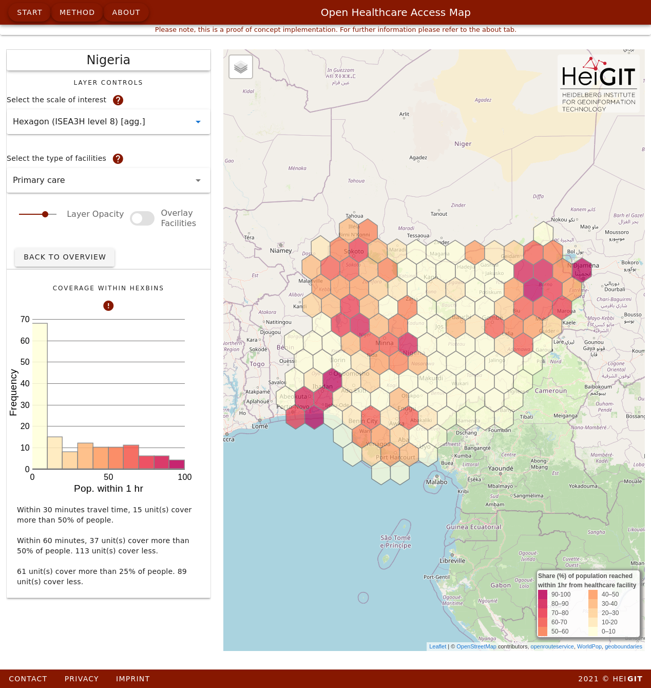
Fig. 4: Nigeria hexagon scale for secondary and tertiary healthcare facilities.
Future development
We will expand the application on a regular basis. The next milestones are to cover more countries and to increase the maximum range beyond 60 minutes. It is also very important for us to include quality indicators for facilities and the road network from OpenStreetMap. Another feature is the delineation of catchment areas and population estimates for individual facilities.
We highly appreciate your feedback on this endeavor. Please let us know your ideas and opinion about the app by mail.
Related work:
- Geldsetzer, P.; Reinmuth, M.; Ouma, P. O., Lautenbach, S.; Okiro E. A.; Bärnighausen, T.; Zipf, A. Mapping physical access to health care for older adults in sub-Saharan Africa and implications for the COVID-19 response: a cross-sectional analysis. The Lancet Healthy Longevity. 2020;1(1):e32-e42.
- Updated OSM Healthcare in Senegal (2020)
- Accessibility to pharmacies in Germany with 15km Covid-19 restriction
- Accessibility of covid-19 vaccination centers in Germany
- xploring OSM for healthcare access analysis in Sub-Saharan Africa
- Exploring OSM history: the example of health related amenities
- Recent changes to OpenStreetMap healthcare infrastructure in India
- Insights into OpenStreetMap healthcare attributes in India over time
- Analysing OSM Completeness of health facilities in Sub-Sahara Africa in ohsomeHeX