What is the idea behind the Notebook?
In the case of an emergency (e.g. floods, earthquakes, political crisis) it is important to know where the health facilities are located. Furthermore, it is important to identify which cities/districts have a reduced or no access at all to health facilities before an emergency. Many countries still posses a centralized health system, making the tasks of the emergency workers even more difficult. In order to get accurate information from the health facilities, we retrieve the latest data that is available in the OpenStreetMap database. Two years ago, we wrote a Blogpost where we introduced a Jupyter Notebook that used our openrouteservice (ORS) Isochrones API in order to determine the access to health facilities in Madagascar. The notebook has been improved and updated and is now ready to be used with the latest version of the ORS API.
Check out the new interactive version of the notebook in nbviewer.
The biggest improvement of this new Jupyter Notebook is the automation and globalization of the analysis. In other words, the user just has to insert the ISO-3 code and the name of the desired country at the begin of the script. For example, if we want to make an analysis for Bolivia, we just need to insert the ISO-3 code (”BOL”) and the oficial name (”Bolivia”). This is a big improvement because the user doesn’t have to get his own data (e.g. shapefiles). By entering the ISO-3 code, the user automatically downloads a geojson file with the administrative boundaries (admin_level 2), a geojson with the points of the health facilities from the ohsome API and finally, a population raster from worldpop.org.
Another important upgrade is the implementation of the Python module rasterstats. The module replaces an old script that was used for the statistics and it includes a function called zonal statistics. The function returns the statistics of the raster. This allows us to count and sum up the population for each district or isochrone in an easy and sophisticated manner. Lastly, the results are displayed in a choropleth map with multiple layers. We implemented GeoPandas and Folium in this last part.
Analysis of two countries – Comparing Health Care Access for Azerbaijan and Czech Republic
Workflow
Let’s have a look at the script. In the following examples, we will apply the notebook in the Republic of Azerbaijan and the Czech Republic. The first step is to enter the ISO-3 code and the name of the country that we want to analyse. The script will automatically download the boundaries, the health facilities (nodes) and the “World Population” raster.
After this step, the analysis begins. The first task of the analysis is to create a districts dictionary that will save, for example, the population data from the raster. The overview map will show the user how the health facilities are distributed in the country.
Another important step is to calculate the access to health facilities per district. For this step, the script grabs the isochrones that we got from the ORS API. Combined with the population data stored in the raster, we are then able to calculate how many persons have access to a health facility on a district level.
Finally, the script saves the output as a geojson file. In order to check if the data has been written properly, the script displays the dictionary that was created at the beginning as a Pandas DataFrame. The final choropleth map has three layers. It allows the user to switch between the population count and the percent of the population in each district that is able to reach the health facilities via car or foot in a certain amount of time. The cursor displays the name of the district and the data.
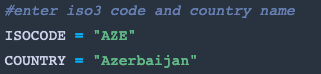
Fig 1. ISO-3 code and name from Azerbaijan


Fig 3. The final results from Azerbaijan displayed as a Pandas Dataframe
Results
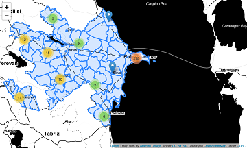
The last step of the script is to display the results of the analysis in an interactive choropleth map with three layers. For example, we can observe that in Azerbaijan (see Fig. 4), the persons living in the west and in the capital, Kabu, have a better access to the health facilities.
If we make the analysis for the Czech Republic, we get the choropleth map depicted in Fig 5. Comparing the result in Azerbaijan to the result in the Czech Republic, we could assume that the health facilities in the Czech Republic are more evenly distributed. As a result of this, the percent of people that have access to a health facility in a district increases. This a very basic comparison that is easy to achieve with this new notebook.
It’s important to underline that this script has still some limitations. The topography and relief of a country (e.g. a mountain range) are not taken into account in the ORS API. We are looking forward to improve this aspect and build a notebook that is even closer to the reality.
If you have thoughts or ideas how we can better implement this notebook in order to provide an even more realistic result, don’t hesitate to contact us here: info@heigit.org
Fig 4. Health Care Access for Azerbaijan
![]()
![]()
Fig 5. Health Care Access for the Czech Republic
Related Work and Literature
- Geldsetzer, P.; Reinmuth, M.; Ouma, P. O., Lautenbach, S.; Okiro E. A.; Bärnighausen, T.; Zipf, A. Mapping physical access to health care for older adults in sub-Saharan Africa and implications for the COVID-19 response: a cross-sectional analysis. The Lancet Healthy Longevity. 2020;1(1):e32-e42.
- openrouteservice Github Repository and further openrouteservice-examples
- Blogpost 2018