Each November, the #30DayMapChallenge invites people worldwide to create and share maps, with a new theme for every day of the month. Started in 2019 by Finnish geographer and cartographer Topi Tjukanov, the challenge welcomes everyone, no matter which tools, data, or technologies they use. Participants can choose any number of daily themes, making it a great chance to try new mapping ideas and share them with the geospatial community.
In 2024, HeiGIT shared maps on 20 days of the challenge, using ongoing research, open geospatial data, and various projects and tools. These maps covered topics like mobility, humanitarian accessibility, OpenStreetMap data quality, climate change, heat stress, and GeoAI. Here’s a look back at what HeiGIT contributed to the #30DayMapChallenge 2024.
1. 1 November 2024 – Day 1: Points
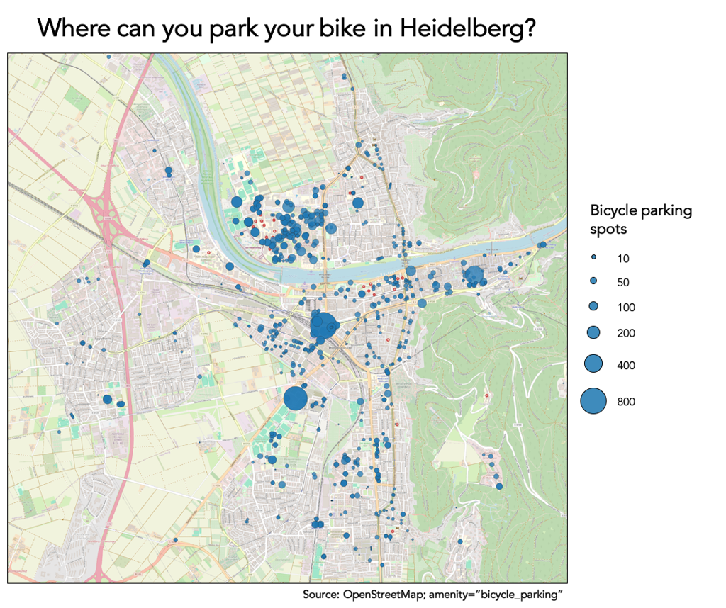
Bicycle Parking in Heidelberg
The first contribution maps where bicycle parking facilities are located in Heidelberg and how many bikes each can hold, using OpenStreetMap data. It points out places with a lot of bike parking, such as Heidelberg University’s Neuenheimer Feld campus and the main train station. The map shows that having good bicycle parking helps make cycling easier for daily use.
2. 2 November 2024 – Day 2: Lines
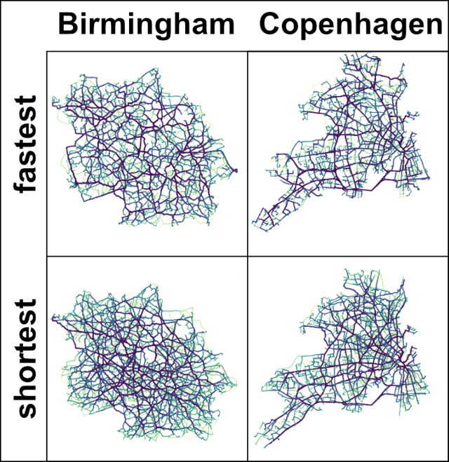
Routing Networks in Birmingham and Copenhagen
This map shows car mobility in Birmingham and Copenhagen by using 300 × 300 randomly generated routes in each city. Using openrouteservice the analysis compares the fastest routes, which are chosen for travel time, with the shortest routes, which are chosen for distance. This highlights different patterns of road use and network centrality. Fastest routes usually follow main roads, while shortest routes spread out more across the network.
3. 3 November 2024 – Day 3: Polygons
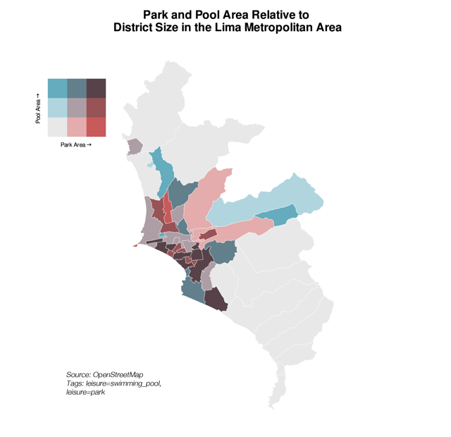
Pools and Parks in Metropolitan Lima, Peru
The map here shows pools and parks across the various districts of Metropolitan Lima, using the most recent geometries from OpenStreetMap. For each district, the total area of pools and parks was measured and compared with the district’s area. This highlights which areas have more or less pool and park coverage. In many southern districts, both pools and parks take up a large share of the area. In eastern Lima, there is more variety, with some districts having lots of parks, while others have more pools but not much park space.
4. 4 November 2024 – Day 4: Hexagons
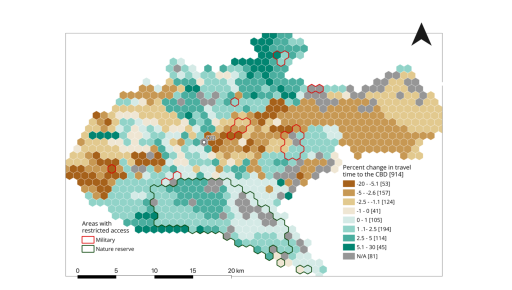
Traffic and Travel Times in Nairobi, Kenya
This map looks at morning rush hour travel times towards Nairobi’s central business district using hourly mean travel speed data from Uber Movement, which were compiled for use in openrouteservice. The analysis compares travel times based on Uber traffic data with the fastest routes calculated without traffic information for 914 hexagons across Nairobi. Out of these, 458 had longer commute times when using the traffic data, while 375 had shorter travel times. These findings help researchers understand differences seen during school term months.
5. 6 November 2024 – Day 6: Raster
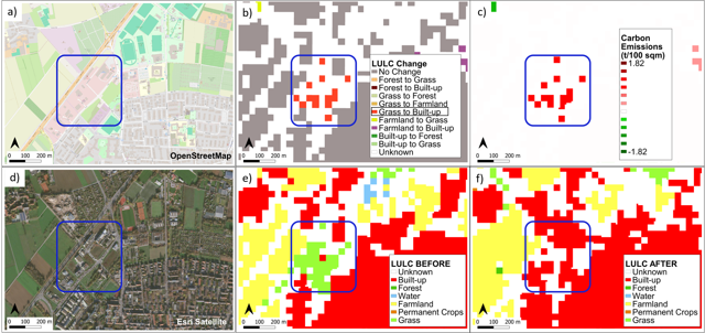
Land-use and Land-cover Change Emissions in Heidelberg
Developed by the HeiGIT Climate Action Team, the Land Use Land Cover (LULC) Change Emissions Estimation plugin measures carbon emissions from land-use and land-cover changes in a chosen area and time frame. The map displays plugin results for Heidelberg from 2017 to 2024. It includes an emissions density layer, where red shows net carbon emissions and green shows net carbon sinks, along with the detected LULC changes. Reference layers are OpenStreetMap, satellite images from November 2020, and LULC classifications from May 2017 and July 2024.
6. 8 November 2024 – Day 8: Data: HDX
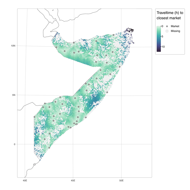
Accessibility to Food Markets in Somalia
This map displays how long it takes to reach the nearest food market in Somalia, showing the differences in access to basic goods. Using openrouteservice, routes were calculated from 44 markets to around 20,000 hexagons based on World Food Programme information published on the Humanitarian Data Exchange (HDX). The map was created for an anticipatory action project with the Somali Red Crescent Society and the German Red Cross.
7. 9 November 2024 – Day 9: AI only
Mapping Nearby Bus Stops with GeoPrompt
For the AI only theme, HeiGIT tested GeoPrompt, a web app that lets users create routes and maps by talking to large language models in plain language. The application was asked to show all bus stops within a ten-minute walk of HeiGIT’s offices in Heidelberg. GeoPrompt was being developed to work with models like ChatGPT and Llama, showing a conversational way to handle geospatial tasks. by: Marcel Maurer
8. 11 November 2024 – Day 11: Arctic
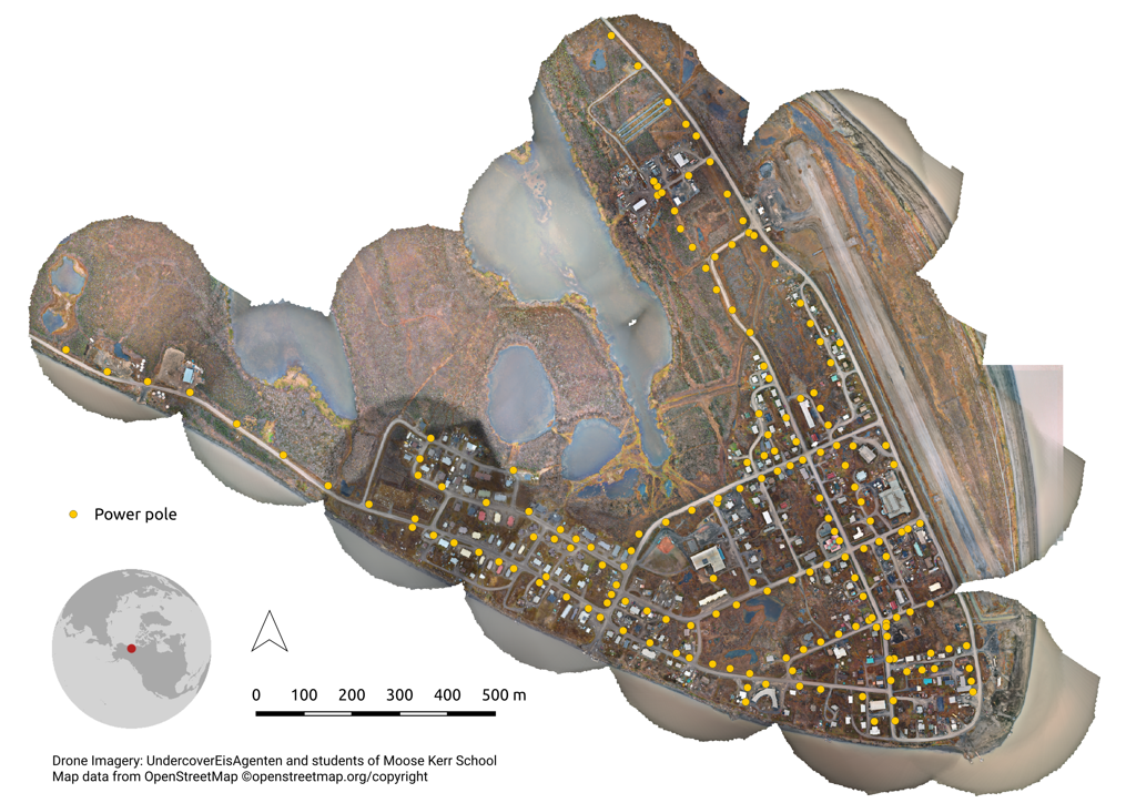
Crowdmapping Power Poles in Aklavik, Canada
Students at Moose Kerr School in Aklavik used drones to take pictures of their community. Later, ninth-grade students in Berlin used these images to find and mark power poles. With the help of HeiGIT’s MapSwipe app, they added important infrastructure in Aklavik to OpenStreetMap. This project was part of UndercoverEisAgenten, which works with young citizen scientists.
9. 12 November 2024 – Day 12: Time and space
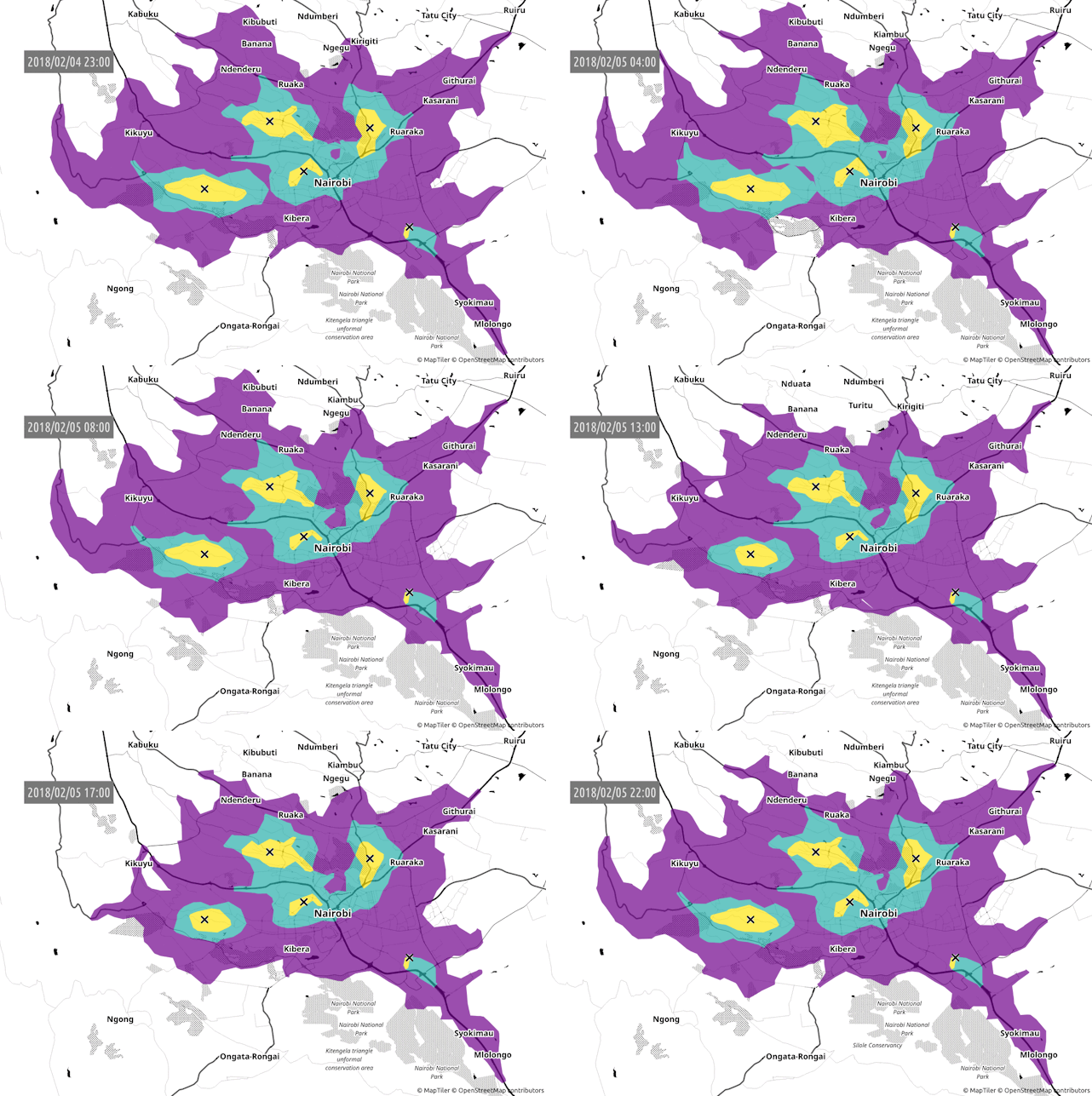
Nairobi’s Traffic throughout the Day
This animated map shows how car travel times in Nairobi change during the day, using 5, 10, and 20-minute isochrones around five locations. Made with openrouteservice and Uber Movement open data, it highlights a clear rise in travel times from 1 p.m. to 7 p.m. The visualization reveals that traffic stays heavy for several hours, not just during a typical rush hour.
10. 13 November 2024 – Day 13: A new tool
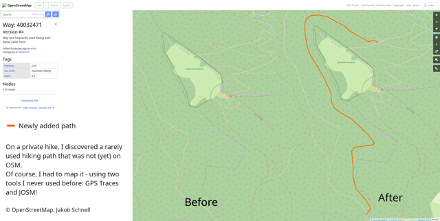
A Hike with GPS Traces and JOSM
While hiking, Jakob Schnell found a path that was not yet mapped in OpenStreetMap. For this challenge, he recorded the route with GPS traces and used JOSM to add the missing path to OSM. It was his first time using both tools. This example shows that even small local mapping efforts can help improve open geographic data.
11. 14 November 2024 – Day 14: A world map
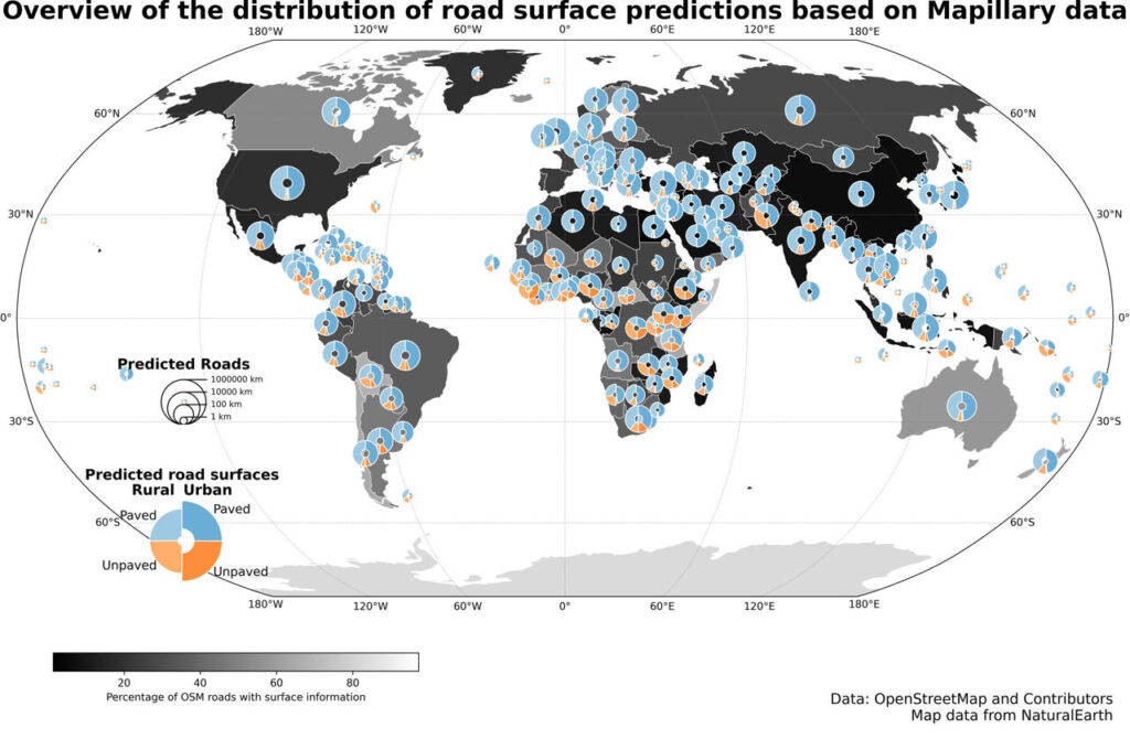
Global Road Surface Data
This world map was released along with a global dataset that shows the difference between paved and unpaved roads. The dataset was made using GeoAI techniques and street-level images from Mapillary. It helps fill gaps in road-surface information and adds value to OpenStreetMap. The map shows where data coverage varies around the world. The dataset can be used for routing, humanitarian work, infrastructure planning, and other geospatial projects.
12. 15 November 2024 – Day 15: Data: My data
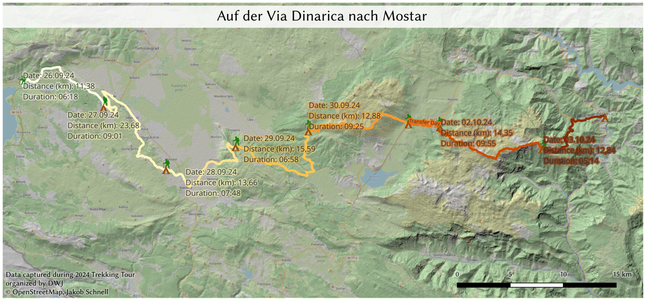
A Trekking Trip in Bosnia and Herzegovina
For Data: My data, the challenge became personal by visualizing Jakob Schnell’s trekking trip through Bosnia and Herzegovina. The map uses data from his journey to show the route and turns his travel experience into a cartographic record.
13. 18 November 2024 – Day 18: 3D
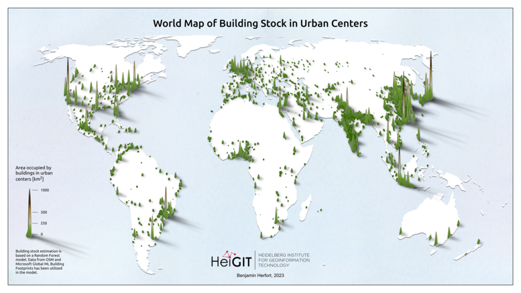
Global Building Density and OpenStreetMap Completeness
This map highlights areas around the world with the most concentrated building stock, especially in East and Southeast Asia. The ohsome framework was used to compare this information with historical OpenStreetMap building data, checking completeness across 13,189 urban areas. The results show some regions have a lot of buildings but not much related data in OSM.
14. 20 November 2024 – Day 20: Data: OpenStreetMap
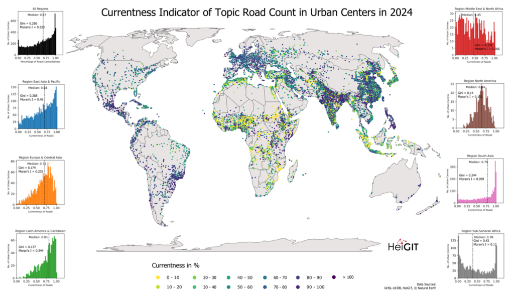
How Up-to-date Is Road Data in OpenStreetMap?
This world map looks at how current road data is in cities by using the ohsome quality API (OQAPI). The analysis focuses on the topic of “roads” and uses “currentness” to show how recently OpenStreetMap data has been updated. Higher values mean the information is more up-to-date, while lower values suggest that road data might be older or not updated as often.
15. 21 November 2024 – Day 21: Conflict
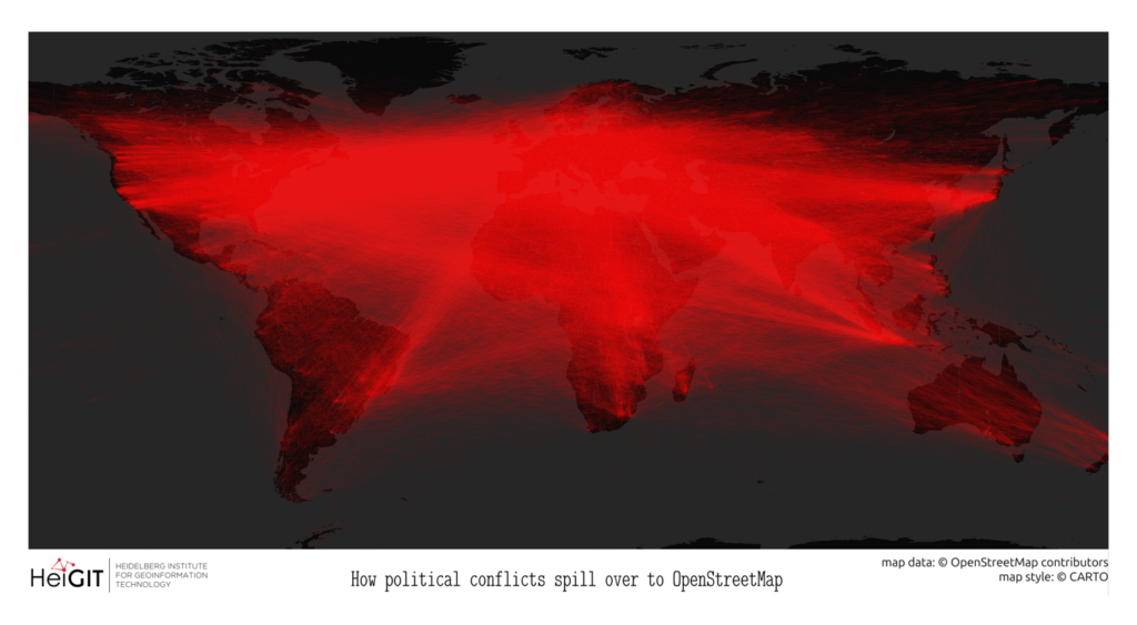
Conflict-motivated Vandalism in OpenStreetMap
This map, created for the Conflict theme, shows thousands of highway nodes in OpenStreetMap that have been moved from their correct locations. The affected highways appear in red. Vandalism like this sometimes happens during political conflicts, when people edit geographic information to change how places or territorial claims are shown. This example shows how changing OSM data can make it less reliable for people who need accurate maps.
16. 22 November 2024 – Day 22: 2 colours
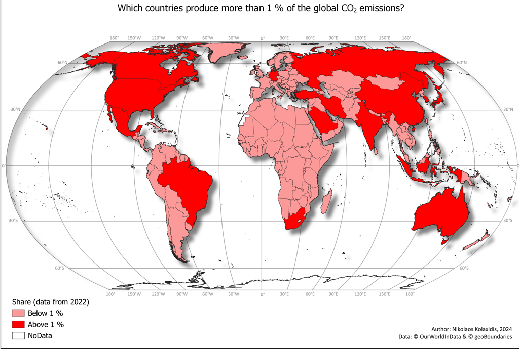
Global CO₂ Emissions
This two-colour world map, made during COP29 in Baku, shows how global carbon dioxide emissions are unevenly spread. Countries that produce more than 1% of global CO₂ emissions appear in bright red, while those with less than 1% are in a lighter shade. Using just two colours makes it easy to see the imbalance in emissions around the world.
17. 25 November 2024 – Day 25: Heat
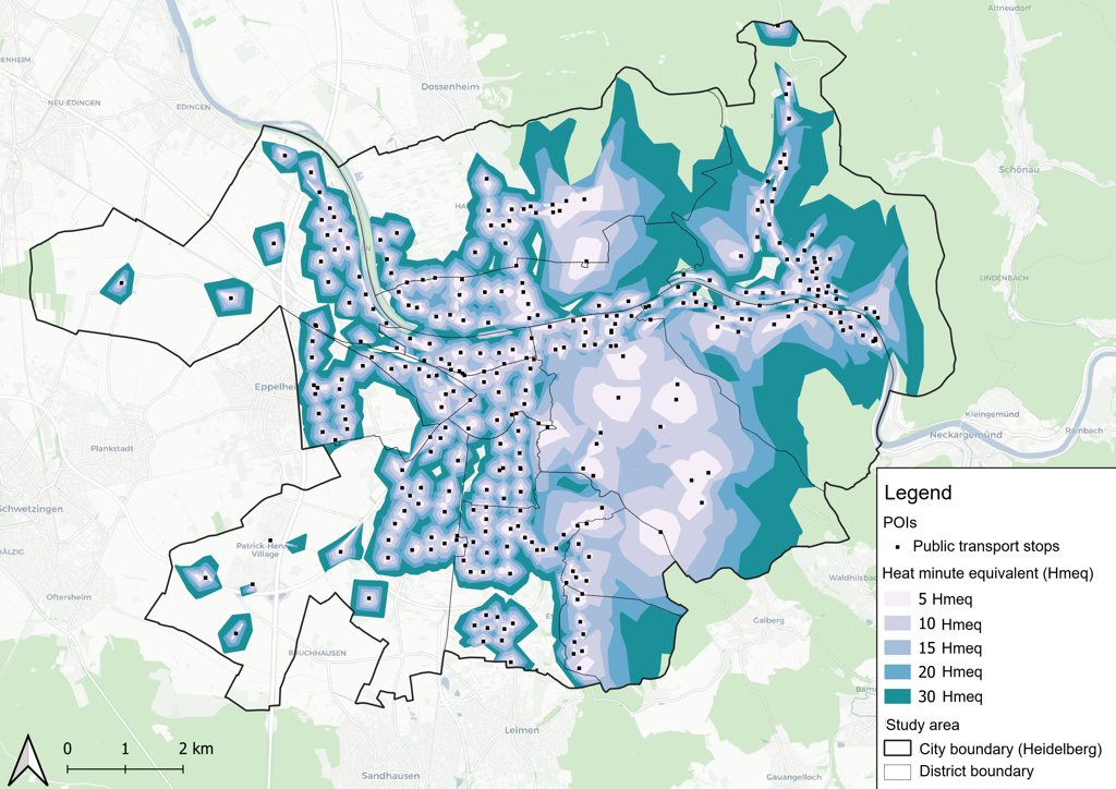
Walking Accessibility under Heat Stress in Heidelberg
This map show how far people who are sensitive to heat can walk from public transport stops in Heidelberg during hot summer weather. The maps use modeled data on shade and heat exposure to compare walking times on a hot day to those on a cool day. Smaller areas mean more sun and heat exposure. The data was modeled for 4 p.m. on 9 July 2023 as part of the HEAL project, showing how shade can change walking accessibility for people who are more vulnerable to heat.
18. 27 November 2024 – Day 27: Micromapping
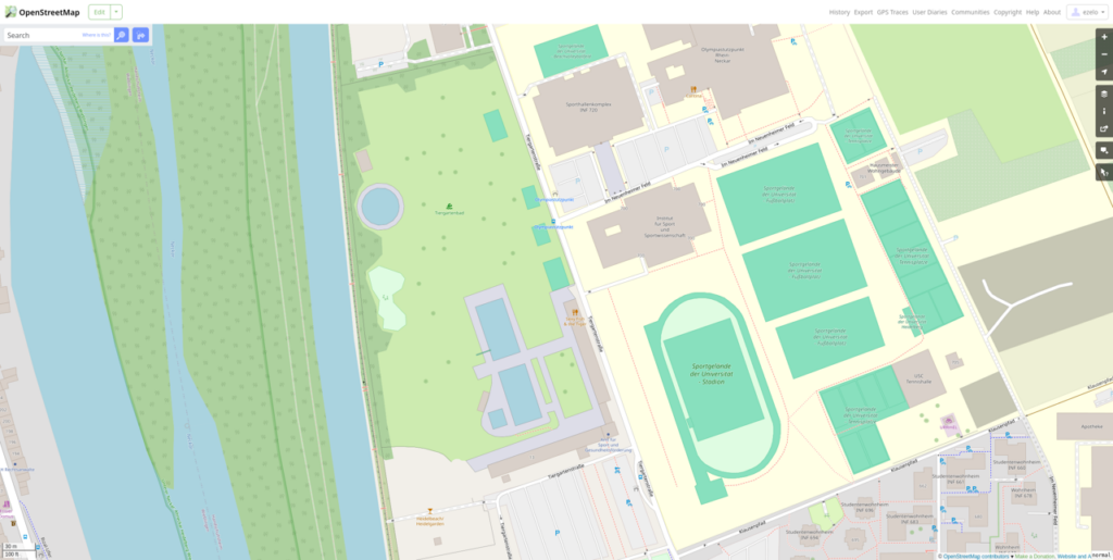
Micromapping a Swimming Pool in OpenStreetMap
For Micromapping, we focused on adding detailed local information to the Tiergartenbad public swimming pool near HeiGIT’s offices in Heidelberg. A before-and-after comparison in OpenStreetMap shows how new features were mapped to give a clearer picture of the site. This example shows how small local contributions can gradually improve OSM.
19. 28 November 2024 – Day 28: The blue planet
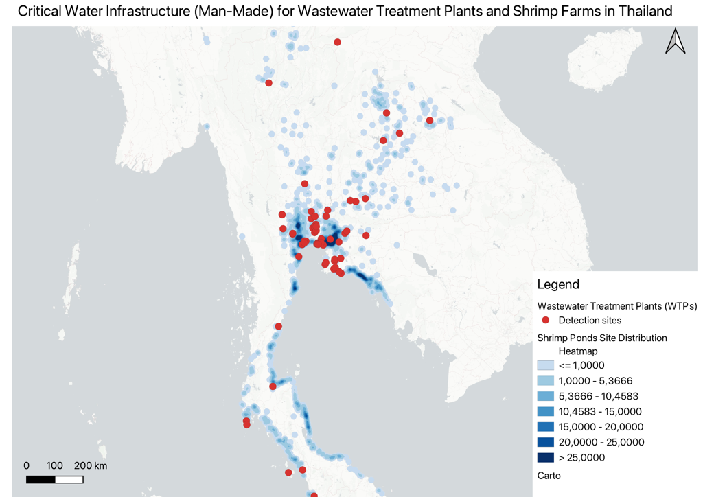
Mapping Thailand’s Water Infrastructure with AI
This map highlights shrimp farms and wastewater treatment plants across Thailand, found using satellite images and a deep-learning model. The AI approach discovered many more shrimp farms than those listed in OpenStreetMap or other datasets, and it also located key wastewater treatment sites for water management. This shows how GeoAI can reveal missing geospatial data for use in aquaculture, environmental monitoring, and sustainable planning.
20. 30 November 2024 – Day 30: The final map
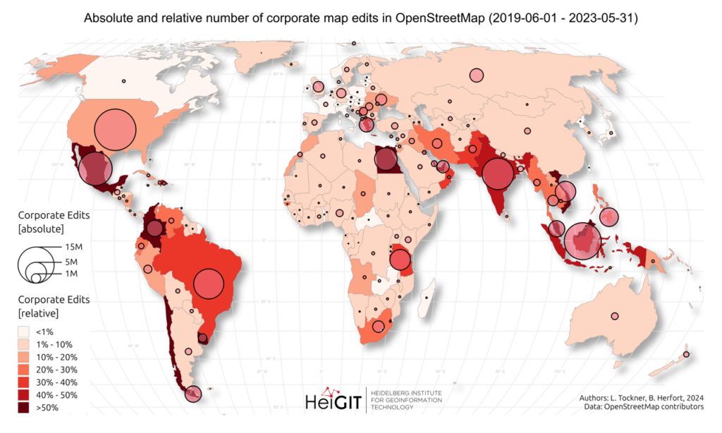
Corporate Mapping in OpenStreetMap
HeiGIT’s final contribution shows where companies have edited OpenStreetMap from 2019 to 2023, both in total numbers and compared to all edits. Over 30 companies, such as Apple, Microsoft, Meta, and Amazon, have teams working on OSM. Corporate mapping is now a bigger part of the platform. This map gives a worldwide view of where these edits happen and how they fit into the overall OSM activity.
Reflecting on HeiGIT’s #30DayMapChallenge 2024, it’s clear that geospatial data and mapping can help answer many different questions. The challenge featured tools like openrouteservice, MapSwipe, the ohsome framework,OpenStreetMap, satellite imagery, GeoAI, and deep learning. It gave us a chance to share our research and try out new tools, datasets, and ways to visualize data. Altogether, these contributions highlight the wide range of geospatial research and development happening at HeiGIT.