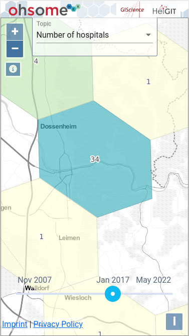
In the modern technological age, mobile application are necessary to reach out to the masses. Therefore, it’s critical for any web application to be available through mobile devices. In the case of ohsomeHeX, enabling use on mobile devices requires overcoming the challenging of screen space use. The application utilizes significant screen space for its side panels to show user-selected datasets as well as for the bottom panel which shows statistics for the selected datasets.
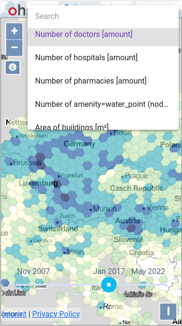
In an attempt to solve this issue, we provide a lite-mode application for any smaller-screen devices. This lite-mode is a limited functionality ohsomeHeX application wherein one can use the time-slider to view temporal changes for an OSM topic over time as well as select between tons of topics available on ohsomeHeX. Users of lite-mode are unable to use certain features such as clicking on the hex/cells on the map to generate datasets for further region-specific analysis. Lite-mode is designed to be an option for getting an overview of OSM changes of topics on the go. However, for a drilled-down analysis, one must still use a full-scale application.
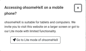
At the start of ohsomeHeX, the application checks for the device’s screen size. If the screen size is discovered to be mobile screen, i.e. screen-width smaller than 600px, then a prompt appears allowing the user to switch to lite-mode. If one is using a permalink to open ohsomeHeX, then the user’s selected Topic, Map Extents and Time Period are preserved when switching to lite-mode.