Using hospital locations and the ORS Isochrone service, we have created a method for comparing physical access to healthcare in Sub-Saharan Africa. Hospital locations were derived from OpenStreetMap and compared against another free available dataset. Results indicate strong similarity in both hospital datasets, however the uncertainty of our method requires further evaluation.
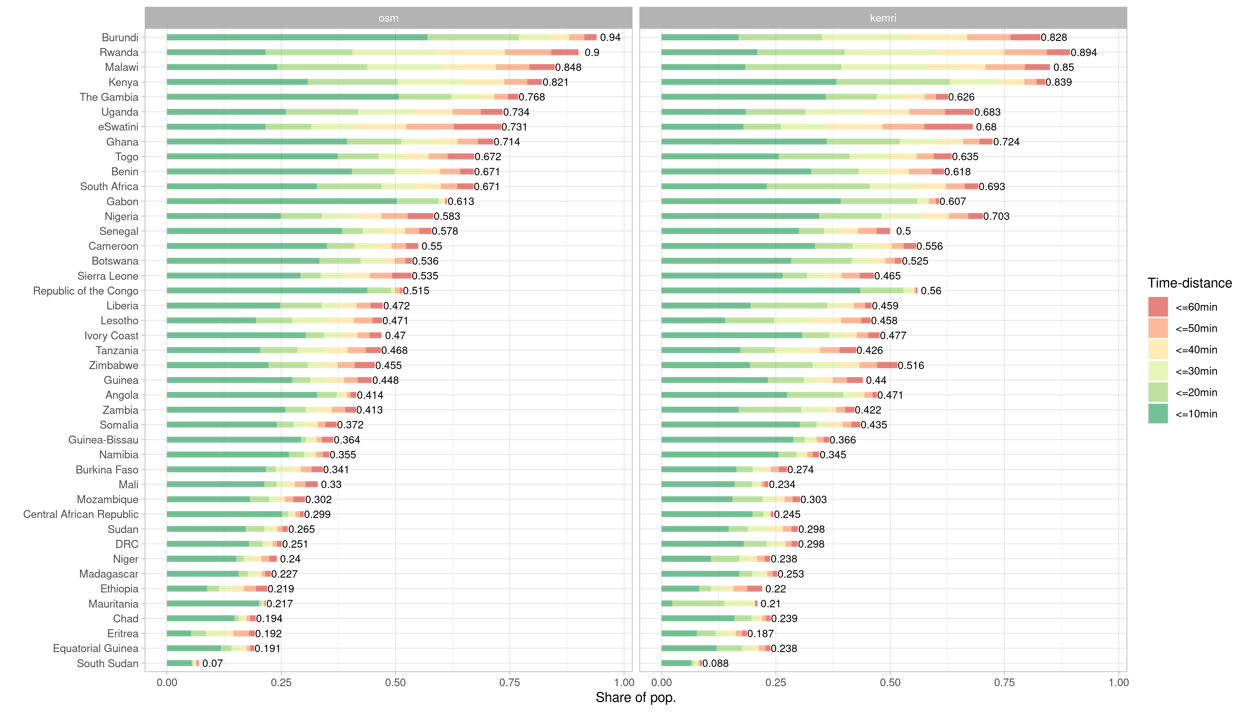
Figure 1 Stacked barchart comparing population proportions reached within 1 hour and within 10 minute intervals for OSM versus KEMRI. (HeiGIT 2020)
Motivation
Since the beginning of the COVID-19 pandemic we have seen the virus traveling around the world. Starting from Wuhan, China in December 2019, Europe became epicenter of the crisis in March 2020 and was followed by the U.S. the next month. Just recently, WHO declared Latin America the new epicenter, with cases on the rise especially in Brazil. Africa, a continent of ~1.27 billion people and only ~2000 ventilators received little media coverage until now. The pandemic reached the continent in late February and spread to every country until mid May. Today there are ~315,000 confirmed cases and ~8,300 deaths reported in Africa. Officially no African country suffered a major outbreak like northern Italy or New York City. But chances are an outbreak could occur undetected for a while. In the global race for virus gear, African countries lack the economic power to compete for medical resources for response and testing efforts (Kavanagh et al. 2020). Therefore the structure of health systems will presumably play a key role in coping with the pandemic.
Method
We approached the question about the structure of healthcare systems in Sub-Saharan African (SSA) using a proxy – physical accessibility of hospitals. Using publicly available hospital location data, the openrouteservice ORS Isochrone service and population data, we were able to calculate travel-time distances from hospital locations and the respective reached population per country in SSA. In a previous blogpost we compared the completeness of health facilities mapped in OSM with a repository of public health facilities assembled by a team of the KEMRI-Wellcome Trust Research Programme (Maina et al. 2019). For the analysis in this blog, we used both OSM and KEMRI facilities. For each country we requested 1hour travel time isochrones using a car-driving profile. Afterwards, we merged the isochrones and extracted population information from a 1km raster grid by WorldPop.
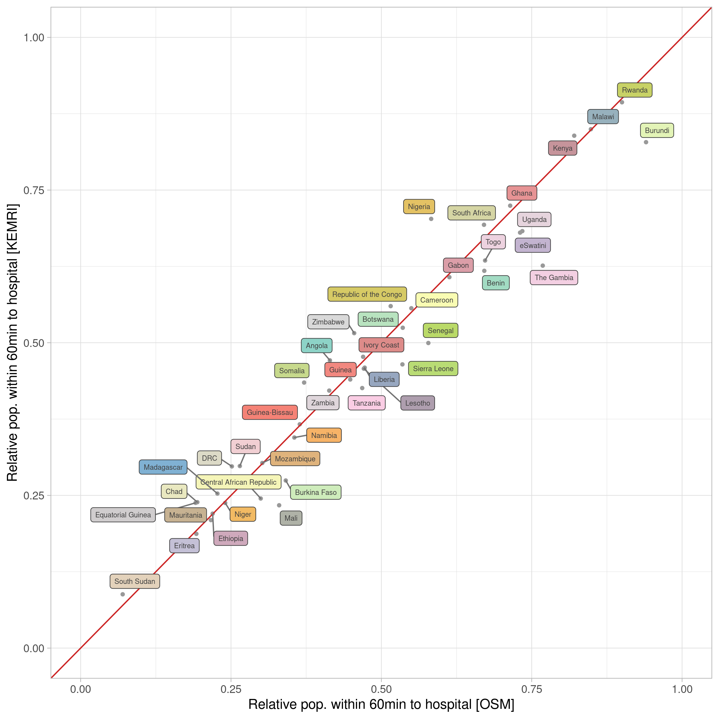
Figure 2 Scatterplot of population proportions reached within 1 hour using either hospitals mapped in OSM or KEMRI. Pearson. (HeiGIT 2020)
Findings
Although both datasets differ significantly in the number of hospitals represented, we found that disparities are rather marginal when used for an accessibility analysis (figure 1). The part of the population within an hour driving distance is 49.8 % when using hospitals mapped in OSM and 47.9% when relying on hospitals in KEMRI. The country with the least reached proportion of inhabitants for both data sources is South Sudan (OSM: 6.99%; KEMRI: 8.81). The best performing country for OSM is Burundi, for KEMRI it is Rwanda. KEMRI offers 4,831 hospitals for SSA, whereas in OSM with 13,460 almost three times as much hospitals are provided. The mean difference in reached population is 5% and ranges from 0.06% in Ethiopia to 14.9 % in the Gambia. Overall, there is a strong correlation of population proportion reached by both data sources indicated by a Pearson r of 0.973 (figure 2).

Figure 3 Maps on distribution of population, time-distance from hospitals and hospital locations for OSM and KEMRI. (HeiGIT 2020)
When we look at the differences at the country level we see that effects of over– or underestimation of hospitals is not crucial for our analysis. Figure 3 shows the distribution of population, hospitals and reached area within 1 hour for Nigeria and Lesotho. Nigeria is represented with 2,907 hospitals in OSM and 887 in KEMRI. Lesotho with 56 in OSM and 14 in KEMRI. Regardless of OSM overestimating the amount of hospitals by far, reached proportion of population for Nigeria differs only about 11.9% and for Lesotho 1.3%. Although disagreeing on the amount of hospital facilities, OSM follows a similar distribution like KEMRI and vice versa.
But how do patterns of facility distribution like we see for Nigeria emerge? The central north is super densely covered by hospitals. A bit of research revealed data imports in the region. In Kano and Bauchi, two states in the very same location were subject to an import of ~1,500 facilities in 2014. For Borno state, located north east ~ 500 facilities were imported in 2015.
Limitations & Outlook
Further research on the reliability of the results is needed. The accuracy of both KEMRI and OSM is questionable and requires robust assessment. The underlying model of the isochrone service uses the OSM road network. Completeness and accuracy of OSM can vary across regions. Additionally the isochrone model is built to cover a global scale, therefore the time distance estimates must be treated with caution, especially in regional contexts where we assume travel speed to differ from estimates in more industrialized settings. Tools and services like the OpenStreetMap History Analytics platform ohsome and ohsomeHEX will help us to better understand OSM data and its evolution in this and other contexts. Stay tuned as we will dig deeper into the question on how meaningful our results are in a coming blog post.