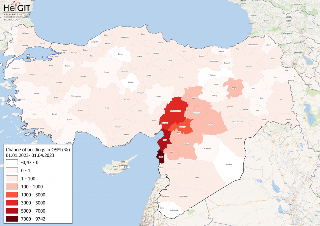
Featured Map: Percent change in each province of Türkiye and Syria of buildings in OSM. Data from OpenStreetMap, visualized using QGIS and the ohsome API plugin.
Welcome back to the how to become ohsome series! If you’re new to the series, you can check out the previous issues (like this one) or the ohsome Region of the month series (like this one).
In this newest blog, we want to show you how you can combine the different ohsome tools. The topic for today: Mapping Changes in OpenStreetMap (OSM) after the Earthquake in Syria and Türkiye in February 2023. The goal is to obtain relevant information concerning the amount of data contributed in OSM following the earthquake as well as to explore which regions experienced the most intensive mapping activity, the increase level, and over which time period.
Three different methods will be presented:
-
Change per Region
-
Small Scale
-
Elements history
Current geospatial data is crucial for an effective and fast humanitarian response after a natural disaster. Often, extensive mapping activity is initiated after a natural disaster. These updates to aid response teams in logistics and planning efforts.
A large contributor of topical opensource geospatial data is the Humanitarian OpenStreetMap Team (HOT), who coordinate disaster response by mapping and updating OpenStreetMap (OSM) data. As of February 21, 1,416,862 buildings and 66,947 kilometres of road were mapped by a total of 6,948 OSM contributors.
1: Change per Region –AGGREGATION
Percent change in each province of Türkiye and Syria of buildings in OSM. Data from OpenStreetMap, visualized using QGIS from the ohsome API.
Our first visualization shows the percent change of buildings in OSM in each province of Türkiye and Syria. There are several ways to show percent change in QGIS when one wishes to display the correlation between the number of change in elements and earthquake intensity. The first and maybe simplest way is to use the ohsome dashboard.
For any analysis done with the ohsome API, the ohsome dashboard offers a helpful overview and clear representation of data. Our last blogpost on the topic offers a more in-depth description of the use of the dashboard. We first seek an overview, plotting building count for Syria and Türkiye as a whole. Next, for a more granular comparison, we separate building county by province and select all provinces in these countries, with a selection of the Syrian provinces shown in the screenshot below.
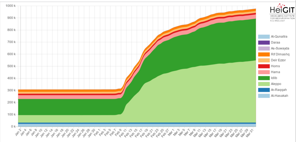
The filter was set to “building=* and building!=no and geometry:polygon”, which are the settings used for all following analyses as well.
The time frame was set to 01.012023 – 01.04.2023 using a 1-day interval.
As the graph shows, starting from 09.02.2023, there has been an exponential increase in buildings in OSM. In particular, some regions such as Aleppo or Idlib showed an increase of over 1000%. Mapping activity slowed down in some provinces in the beginning and middle of March.
In order to calculate the percent change and visualize it in QGIS, the data from the ohsome dashboard can be downloaded either as a csv or json file. The calculation can be done in Excel, R, or other platforms and then loaded into QGIS. It might be helpful to change the interval from 1 day to 1 month in order to have more concise numbers.
One alternative is to complete every step in QGIS. One prerequisite for working with the ohsome API in QGIS includes the ohsome plugin, which needs to be downloaded. you can find the documentation regarding the QGIS plugin here. The admin boundaries for Türkiye and Syria were taken from this site. We used OSM Wikimedia for the base map.
To get the change in buildings, the “data aggregation – elements/count – group by boundary” parameters were used.
The polygon layer for the admin boundaries for Syria and Türkiye respectively were used as the input polygon layer.
The filter was again = “building=* and building!=no and geometry:polygon”
The chosen interval was 01.01.2023 – 01.04.2023 in 1-month steps.
After the information has been added to QGIS, the visualization can start. Data will not yet be loaded with the percent change as a separate column in the attribute table, so a separate calculation must follow if the aim is to show this change as a percentage. It is possible to do the calculation in QGIS. Alternatively, the amount of buildings mapped buildings could simply be displayed with this information.
It is helpful to merge the two layers for Türkiye and Syria either initially when adding the admin boundaries into QGIS or at the end, after using the QGIS plugin in order to obtain combined categories for both countries.
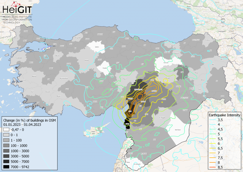
To show the correlation between the earthquake impact and the mapping activity, additional data concerning the earthquakes intensity was added to the map extent. The data was taken from the Humanitarian Data Exchange.
On the OSM website, their mapping project is described in more detail alongside the current state of the mapping process and ongoing projects.
2. Small Scale Change: CONTRIBUTIONS EXTRACTION
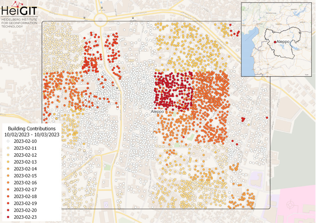
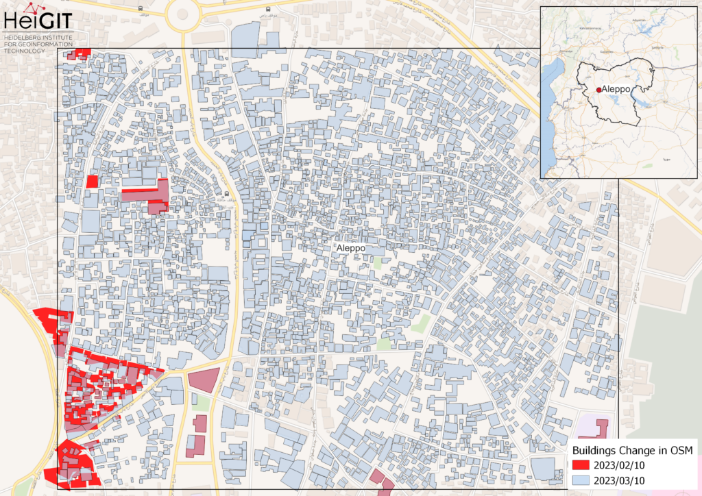
The QGIS ohsome plugin can also be used with the data extraction feature. The geometry (or bounding boxes or centroids) of OSM features can be extracted for a specific time interval. With this feature, the OSM contributions over a one-month period in a district of the Syrian region of Aleppo can be visualized. The figure below shows the contributions to OSM on a daily basis starting from 10.02.2023. After 19.02.2023, the contributions were more irregular.
The parameters for the plugin to show this contribution change were:
Data extraction – contributions – centroids.
filter = “building=* and building!=no and geometry:polygon”
Interval: 10.02.2023 – 23.03.2023
The time frame was chosen because we ran a previous test and the ohsome dashboard revealed that the chosen extent in Aleppo contributions only started to pick up on 10.02.2023. Additionally, the centroids of the buildings were displayed instead of the geometry for a simpler view.
One more map was created using the Data extraction – elements – geometry feature. The intention was to represent the complete picture of the buildings geometry change in this one-month time period. The transparent blue layer represents the buildings that were added in the one-month period. Notably, some of the original geometries were moved or overworked in this period.
Elements History
Finally, a last analysis using the ohsome API with some simple python programming was completed. The exact building count for each country can be visualized in more detail. The figure below shows the contributions to OSM in the time period from 01.01.2023 – 01.04.2023. Further analysis differentiating between the contribution type (for example, see past blogs) would be possible as well. Detailed documentation on the API can be found on the relevant page, while the GitHub page offers further documentation and a tutorial.
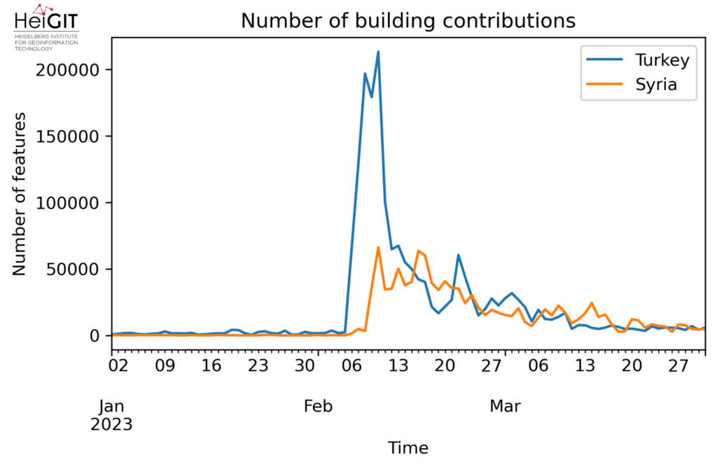
The first endpoint: URL = ‘https://api.ohsome.org/v1/contributions/count’
Parameters:
“bpolys” : “bpolys”,
“filter”: “building=* and building!=no and geometry:polygon”,
“time”: “2023-01-01/2023-04-01/P1D”
The goal for today was to show some varied use of the different ohsome tools employed to analyze one important topic. We also sought to reassure new users that the tool can be used with relative ease without any extensive programming knowledge or QGIS experience. Stay tuned for the next installment of our series!
Background info: the aim of the ohsome OpenStreetMap History Data Analytics Platform is to make OpenStreetMap’s full-history data more easily accessible for various kinds of OSM data analytics tasks, such as data quality analysis, on a regional, country-wide, or global scale. The ohsome API is one of its components, providing free and easy access to some of the functionalities of the ohsome platform via HTTP requests. Some intro can be found here:
- ohsome general idea
- ohsome general architecture
- how spatial joins queries work in the OpenStreetMap History Database OSHDB