Get valuable insights into the quality and development process of OpenStreetMap data with ohsomeHeX!
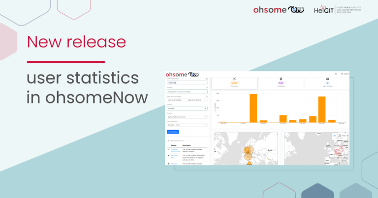
We are proud to announce a new release that provides a completely redesigned UI that makes it easier to keep track of all relevant information. Choose one or more topics, choose different areas of interest and let ohsomeHeX create comparison graphs for you. Observe the development of your data topic over time and check against the provided user activity graph to get an idea of the quality of OSM data with respect to time, space, and topic.
The new layout of ohsomeHeX follows the design idea of open design, where the user gets all of the information at once, like users know it from dashboard applications. This is in contrast to previous version which had a minimalistic design where information was provided only on request. Based on user feedback we decided to redesign the ohsomeHeX application and we believe that for new and experienced users we could greatly improve the usability and thus the accessibility of the underlying information that we provide. The application is aimed at researchers, practitioners and the interested public and helps exploring tempo-spatial patterns of different topics related to OSM data.
What’s new?
- Graph Panel:
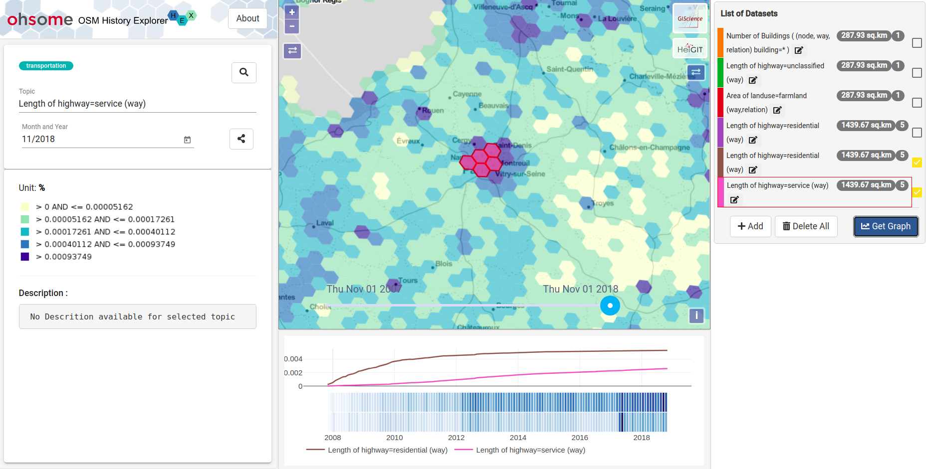
Our new graph panel got a prominent place in the center. Besides the spatial patterns that the user can visually explore in the map, this is the place where the more specific results of a user-defined drill-down are presented. Several selections can be easily compared in a shared graph. - Total Area Display:
Each user-defined selection is now enriched by the number of selected features and an area display that is important when interpreting results of a comparison between different areas of interest. - Editable Selection Titles:
Now, its possible to give user defined names to the user-defined selections. E.g.: If a user is trying to analyse the Number of Hospitals around Berlin and Prague, now the user has an option of giving custom names compared to the default name of the selection which would be the same as both the selection’s Topic are “Number of hospitals“. These titles are also reflected in the chart legend such that this feature helps users to better perceive the meaning of the graph traces.

- Selection Color:
Each selection gets its unique color which is used to display the selected cells on the map and is also applied to the graphs. As a future feature, we plan to give the users the ability to choose a custom color for their selections. - Multi Selection Display:
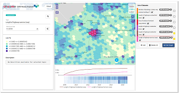
This a major difference to the former version. Now several selections can be displayed at the same time in the map. This is particularly handy when users are interested in comparing either different regions by same topic or same region but differing topics. E.g.: Comparing “Length of highway=residential” with “Length of highway=service” of Paris. This behavior is also more familiar to people who are used to work with layers in professional GIS Software.
We hope our efforts improve your experience with ohsomeHeX. We are looking forward to your feedback! Stay tuned for future updates and features. OhsomeHeX is based on HeiGIT’s ohsome API and it’s underlying OpenStreetMap History Database OSHDB.
If you want to know more about our ohsome framework, don’t hesitate to reach out to us via ohsome(at)heigit.org or contact any member of our team directly. Further Information on the ohsome OpenStreetMap History Data Analytics Platform and more examples of how to use the ohsome API can be found here:
- ohsome general idea
- ohsome general architecture
- the whole “how to become ohsome” tutorials series
- Scientific article on OSHDB
- OpenSource git repositories
- Further publications