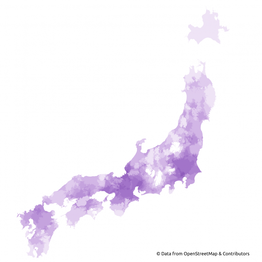
Featured Map: Isochrones (areas reachable within 2 hours from larger Japanese cities) by HeiGIT’s openrouteservice for bigger cities on the main islands of Japan, Marcel Reinmuth’s submission for Day 3 (“Polygons”) of Topi Tjukanov’s Twitter event #30DayMapChallenge. Map derived from OpenStreetMap data.
This past November, our teams at HeiGIT and GIScience participated in Topi Tjukanov’s Twitter event #30DayMapChallenge, where mappers display their creativity and ingenuity with a set of 30 daily prompts ranging from colors to specific datasets to geometric limitations in any sort of map one can imagine. The challenge runs for the entire month of November and has been active since 2019.
As we eagerly anticipate the next round of mapping, we’re looking back at our contributions to last year’s challenge. In this series, we’ll speak to some of the mappers to gain insight into the colorful, innovative, and downright stunning submissions from last November. You can read part one, which looked at three versions of Germany produced by HeiGIT researcher Jakob Schnell. Part two explored an entire project inspired by Day 22’s NULL prompt centered on deleted OpenStreetMap (OSM) elements. In part three, we reviewed maps from our hometown of Heidelberg and the surrounding area. Today, we present our submissions on global topics, from popular musical favorites to infrastructure completion to round out our round-up.
What we initially thought was a gorgeous watercolor for day three’s polygon prompt turned out to be an isochrones map of larger Japanese cities painted by the Geoinformation for Humanitarian Aid team’s Marcel Reinmuth. The image can be seen above as the featured image for this post. According to TravelTime.com, isochrone maps ”show the areas you can reach within a travel time limit.” Marcel’s rendition uses HeiGIT’s openrouteservice to render its areas reachable within 2 hours from major urban centers with clearly stunning results.
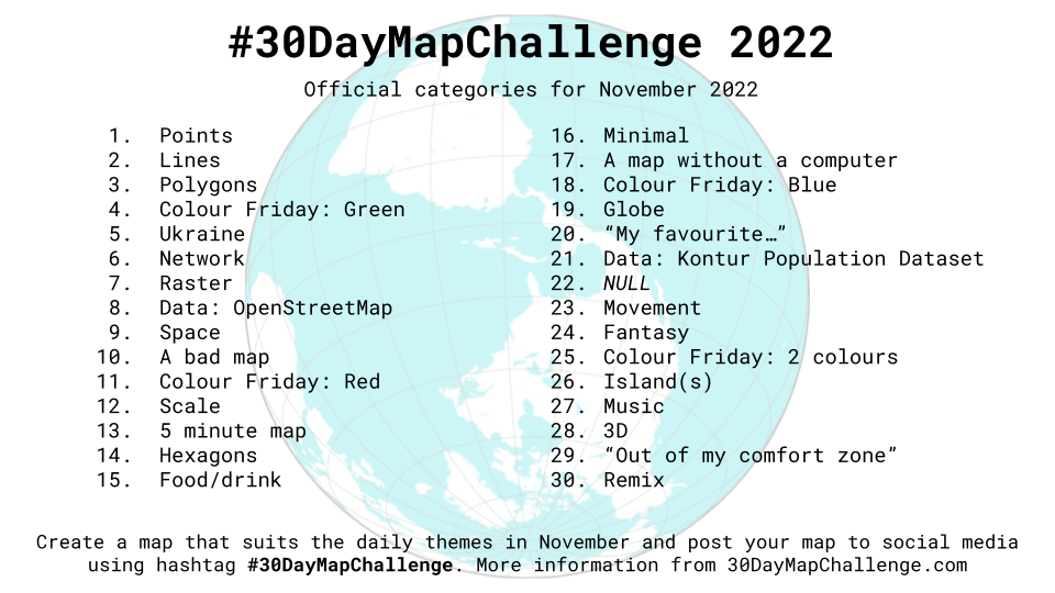
On day six, Dr. Robert Panitz, a research associate in the economic geography research group at Heidelberg University, followed the prompt to create a map displaying networks. According to the researcher, “Crises like Covid-19 and processes like servitization change the way firms operate globally. This generates opportunities for relational upgrading in global value chains and global value networks. J. Glückler & R. Panitz have proposed and empirically studied a set of concepts and network analytical methods to capture changes in Global Value Networks and their geographies: https://doi.org/10.1093/jeg/lbw033.”
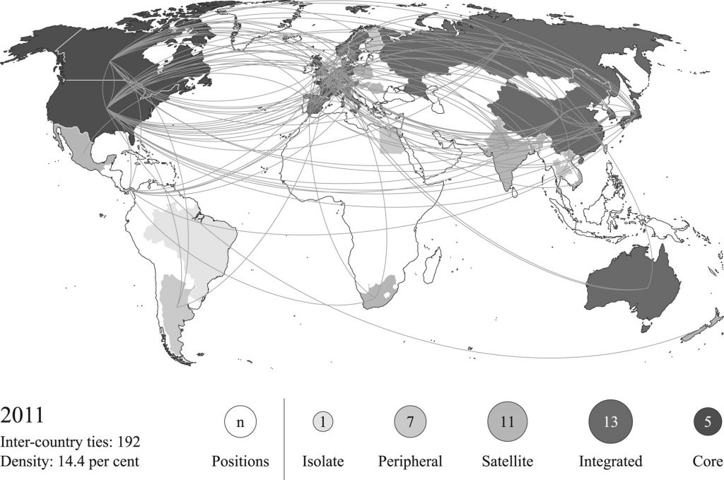
On day 12, the Big Spatial Data Analytics team’s Benjamin Herfort answered the topic “Scale”’s questions: In cartography scale is everything. How to make a map about scale? How to show the importance of scale?
Benjamin wrote, “Scale is especially difficult for world maps. Here we draw the size of a city according to its population. This map uses the Equal Earth Projection, which retains the relative size of areas. More information about the map here:  Investigating the digital divide in OpenStreetMap: spatio-temporal analysis of inequalities in global urban building completeness.“
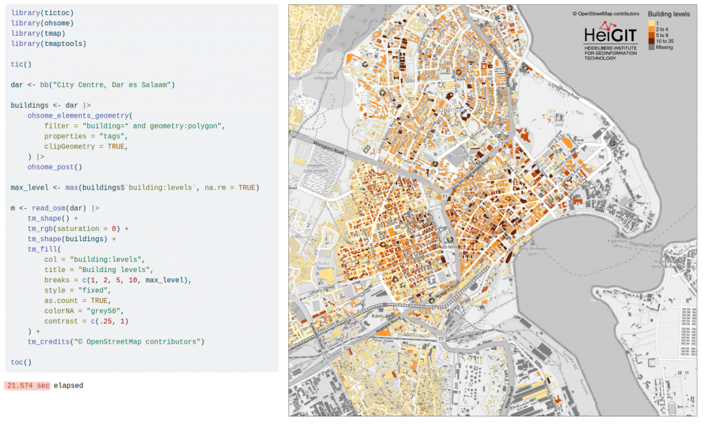
Oliver Fritz of the Geoinformation for Humanitarian Aid and UndercoverEisAgenten team stepped up for day 13’s quick-draw, the 5 minute map. Participants were prompted to set themselves a time limit of five minutes and present their results, with Oliver significantly beating the timer. Using HeiGIT’s ohsome tools as well as rstats and tmap, the time from data query to resulting map of Dar es Salaam building levels clocked in at less than 22 seconds.
Another visualization of the growth of the OSM community (the first one being Marcel Reinmuth’s street lamp mapping progression presented in blogpost three) came on day 14 when HeiGIT Big Spatial Data Analytics team member Mohammed Rizwan Khan submitted a video for the prompt “Hexagons.” Using HeiGIT’s suite of ohsome tools, he charted the number of Buildings in OSM over time as he felt inspired “to visualize the Evolution of Buildings (in OSM) and how similar or different it is globally. For example, buildings in Europe started being mapped in 2007 compared to rarely any being mapped in India or South America [at the time].”
The contribution matters, according to Mohammed, because the “history of data evolution can tell us things about the quality of data.”
Video: The growth of buildings in OpenStreetMap over time, Mohammed Rizwan Khan’s submission for Day 14 (“Hexagons”) of Topi Tjukanov’s Twitter event #30DayMapChallenge. Map derived from OpenStreetMap data.
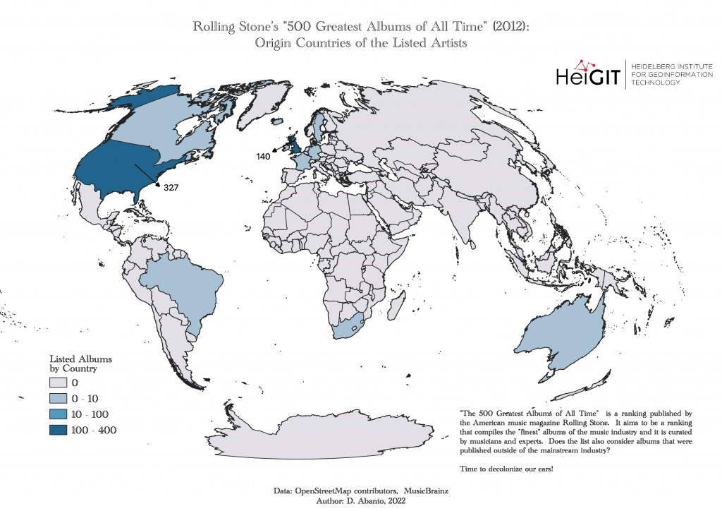
Finally, Day 27 brought with it the challenge of mapping music. HeiGIT’s Daniel Abanto riffed on the diversity of Rolling Stone magazine’s list of the “500 Greatest Albums of All Times,” published in 2012. The results were overwhelmingly concentrated, leading Daniel to question whether lists such as these should venture outside the cultural or national mainstream to include more international artists. We asked Daniel about his inspiration, results, and the albums he would add to the list.
Can you introduce yourself?
I study Geography in Heidelberg, at the moment I am writing my bachelor’s thesis. I was born and raised in Peru but I’ve lived in Germany since April 2017. At HeiGIT, I am (currently) working as a Hiwi (student assistant) in two projects.
What inspired you to make the map?
The main reason is that I enjoy doing music archaeology and to analyze the connection between music and space (geography). I grew up in a city flooded by sounds and all kind of genres.
Therefore, I was thinking about some aspect that could connect music and geography and that could be portrayed as a map. My first thought was to look at the origin countries from records that were published by a label that is known for its diversity – Soul Jazz Records. But getting access to their data was rather complicated. Then I realized that some years ago, I had a look at the Rolling Stone ranking. I still had in my mind that it was very US/UK-centric, but I didn’t know that it was so centric. So yes, it was actually interesting to see this “issue“ depicted on a map.
What are your favorite albums on Rolling Stone’s list?
‘Straight Outta Compton’ by N.W.A, ‘Loveless’ by My Bloody Valentine and The Pixies album ‘Doolittle’.
Which albums would you add to the list?
‘Vida’ by Sui Generis, ‘Ao Vivo Montreux Jazz’ by Hermeto Pascoal, ‘Live in Africa’ by Fania All Stars and ‘Un Verano Sin Ti’ by Bad Bunny.
What projects are you working on at HeiGIT?
I am working on the LOKI Project and the geoEpi Project – a project between GIScience Heidelberg/Heigit, the Heidelberg Institute for Global Health (HIGH) and the Geo-social Analytics Lab, Z_GIS Salzburg.
In four colorful, creative, and diverse posts, we’ve summed up last year’s submissions to the #30DayMapChallenge with maps of Germany and other worlds, deleted maps, visualizations of our own slice of Heidelberg, and finally the world at large. We also make maps outside of social media challenges, with tools and services focusing on mobility, humanitarian aid, and data analytics. Follow our social media channels and stay up to date on our blog for upcoming mapping, conference, and geography content!